Our Wedding Design
I really enjoyed designing the “brand” for our wedding. It was interesting to see how everything developed over the course of a year or two, and I wonder how I would do it differently if I planned out every single element in a shorter time frame.
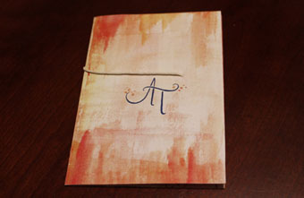
I started out with this monogram logo – I knew from the beginning that I wanted to incorporate hand lettering to bring a personal touch to everything. I sketched out at least 30 different combinations of the “A” and “T” together. I was happy with this one because it’s more than just two letters next to each other, and it allowed me to add some leafy elements on each side to feel like fall, since our wedding took place in October.
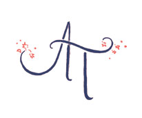
Around the same time that I designed the logo, I (ahem, I mean, “we”) decided on our wedding colors – navy and coral. We liked navy because it would work as a nice contrast to the fall colors, and it would be a unique, classy tuxedo color. Coral would add a bright contrast and bring some character to the typical brown and orange fall colors.
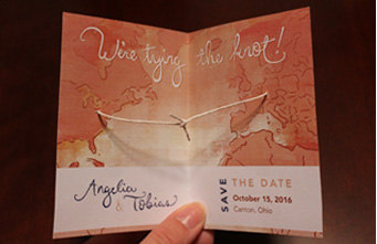
I designed the Save-the-Date next, with the theme of “Tying the Knot.” There’s a twine knot inside that gets pulled tighter as the guest opens the card. I found this idea online, but gave it a personal touch. The twine inside comes from two sides of the Atlantic, where Tobias and I are from – Ohio and Germany – and meets in the middle to represent bringing our two families and cultures together.
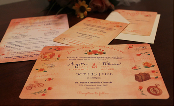
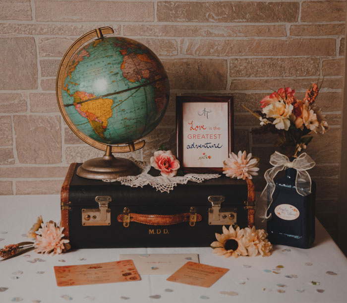
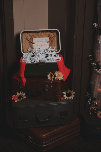
When I visited Germany about a year before our wedding, it really hit me that our two families are becoming one. Though, unfortunately, somebody would always have to make a long trip if we were going to be together. It was there that I was inspired to make the overall theme of our wedding “travel” – because, after all, “Love is the greatest adventure.”
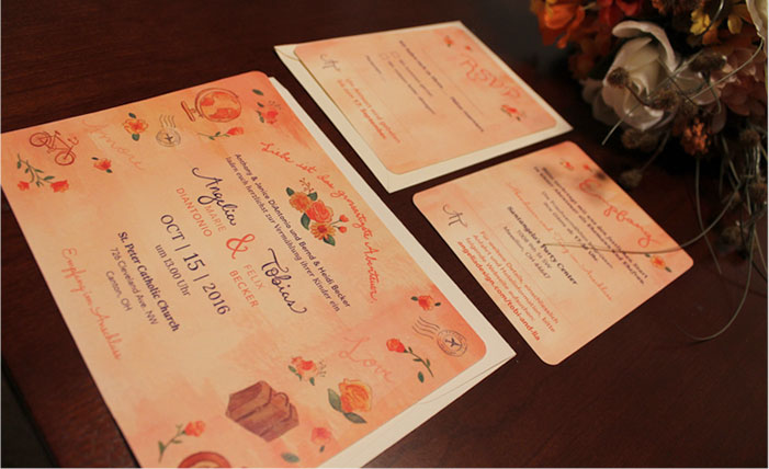
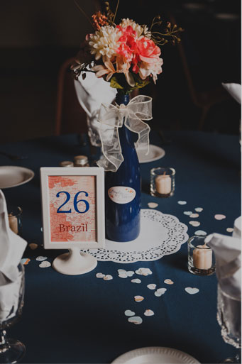
I had a lot of fun making these little water color illustrations and laying out the invitations. To give everything a personal hand-made feel, I created water color textures for the background. I repeated this same look and feel for all of the little elements of our wedding – wine labels on the center pieces, table numbers (which were also maps of different countries), and little signs we had throughout the reception hall. I’ve always been “the artist” of the family, so everyone loved the personal touch and thought it felt just like us.
I enjoyed this process so much that I’d love to branch out my freelance work and start seeing if anyone would be interested in custom wedding invitations and additional design pieces.
